
The Psychology of Colour
There is more to colour than just picking a random combination of what looks good. Colours affect our emotions and behaviours, they set the tone and attract people’s attention towards your brand and web design. Using the right colour or combination of colours in your brand will make a big difference.
The Basics
Before we get on to the details of Colour Psychology I’ll quickly cover some of the basics of colour first.
Primary Colours
There are three primary colours. Yellow, Blue and Red. These “hues” can be mixed to make all other colours. I’ll cover hues in more detail below.
Secondary Colours
Mixing two primary hues together, will create a secondary colour. There are three secondary colours. These hues are green, orange and violet (purple). Green is created from mixing blue and yellow, orange from mixing yellow and red and violet from red and blue.
Tertiary Colours
Tertiary colours are the third set of hues, sometimes also referred to as intermediate colours. These hues are created by mixing the adjacent primary and secondary hues. The six tertiary colours are red-violet, red-orange, yellow-orange, yellow-green, blue-green and blue-violet.
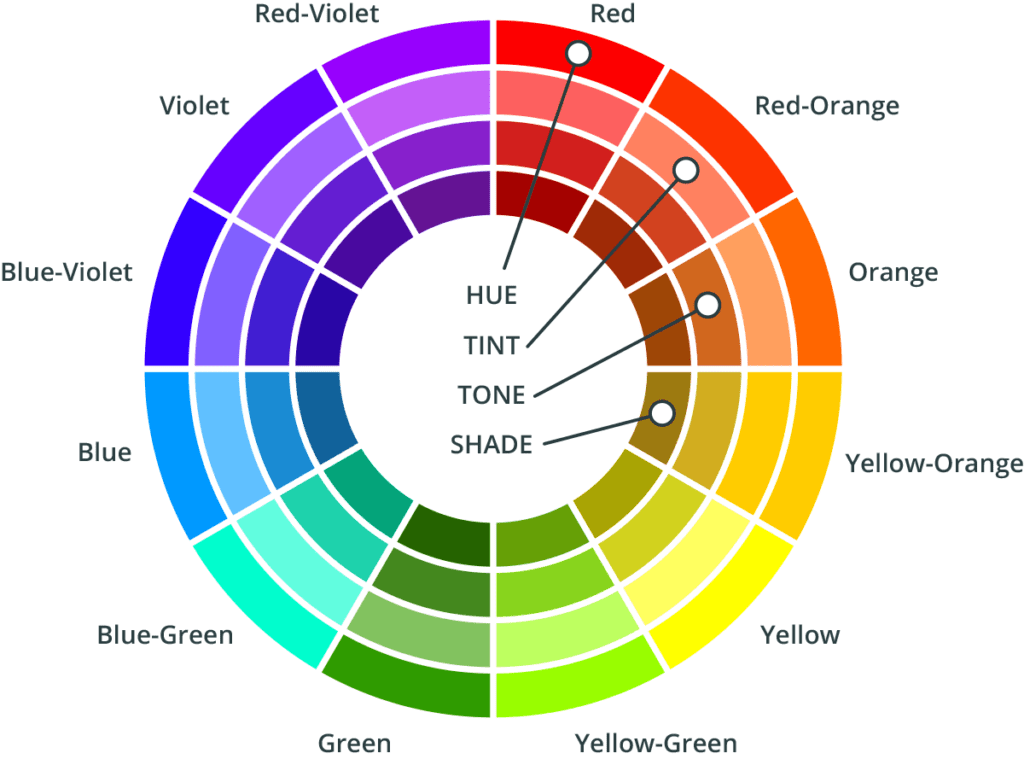
Hue
A hue is the purest and brightest form of a colour, which means they haven’t been mixed with any white, grey or black. The twelve outer colours you see around the above colour wheel are the hues.
Tint
Next down from the hue in the colour wheel (the 2nd ring of colour) is the tint. A tint is the hue mixed with white. A tint can range from mixing a touch of white so it is slightly lighter than the hue or mixing in a lot of white so the tint becomes very faint.
Tone
Underneath the tint is the tone. A tone is the hue at the outer of the wheel mixed with any amount of pure grey.
Shade
The inner circle of colours in the colour wheel is the shade of each hue. A tone is the hue mixed with black. Just like the tint, a tone can range from mixing a touch of black so it is slightly darker than the hue or mixing in a lot of black so that it becomes very dark.
Applying Colour Psychology
The psychology of colour, which is the science of how humans perceive various shades of colour, can make or break a brand. Different colours can evoke different emotions depending on the culture, for example in Western cultures red usually means danger, anger and passion but in Eastern cultures it symbolises joy and luck.
With that said, let’s dive into the common emotions driven by colour.
Red
The colour red is often associated with strong and passionate emotions: Love, Comfort, Warmth, Active, Exciting, Bold, Passionate, Youthful, Energy, Physical, Ambition, Pioneering and Powerful.
Brands you’ll recognise using Red: Coca-Cola, Nintendo, Pinterest, Red Bull and Virgin.
Pink
Pink is often associated with softer and more subtle emotions: Love, Romance, Calm, Respect, Warmth, Feminine, Intuitive, Care, Assertive, Nurture and Sensitive.
Brands using Pink: Barbie, Cosmopolitan, BBC Three and Victoria’s Secret.
Purple
Purple is often seen as evoking spiritual emotions: Creativity, Unconventional, Original, Fantasy, Wealth, Modesty, Distinguished, Compassion, Deep and Respectable.
Brand using Purple: Cadburys, Hallmark, Milka, Zoopla and Yahoo.
Blue
Blue causes calm and serene emotions: Open, Rescue, Control, Content, Perspective, Spirit, Determination, Goals, Modern, Purpose and Ambition.
Brands using Blue: Intel, Blu-Ray, Skype, Twitter, WordPress and Microsoft’s Edge Browser.
Blue (Dark)
Dark blue is often seen as having an authoritative base of emotions: Sincere, Loyalty, Authority, Communication, Peace, Success, Calm, Masculine, Integrity, Trust and Order.
Brands using Dark Blue: Facebook, National Lotto, Reebok, GAP, Tumblr and British Gas.
Yellow
Yellow often evokes cheerful and happy emotions: Warmth, Extrovert, Happy, Freedom, Luck, Delight, Cheerful, Joy, Blessed, Pleased and Alive.
Brands using Yellow: Ikea, McDonalds, Best Buy, Ferrari, Caterpillar, Post-its and Yellow Pages.
Orange
Orange, much like yellow evokes optimistic and spontaneous emotions: Instinct, Warmth, Optimism, Extrovert, Social, Spontaneity, Impulse, Motivation, Excited and Energetic.
Brands using Orange: Fanta, Nikelodeon, Puffin, MasterCard, Amazon, Harley Davidson, Sony Walkman and 2nd Floor.
Green
Green holds a number of emotions from soothing to envy: Balance, Positivity, Nature, Safety, Stable, Clarity, Good Judgement, Equilibrium, Restore and Growth.
Brands using Green: BP, Holiday Inn, Tic Tac, Starbucks, The Body Shop and Spotify.
Black
Black is a dominant colour and often evokes feelings around death and mourning, however it can also denote elegance: Power, Elegance, Mystery, Formality, Classy, Elite, Pristine and Opulent.
Brands using Black: Guinness, Hotel Chocolat, Chanel, Dior, Prada and Armani.
White
White is often associated with purity and emotions of innocence: Pure, Clean, Modern, Innocence, Cool, Virginity, Goodness, Light, Positive, Simple, Hygienic and Efficient.
Brands using White: Apple.
If you’re looking for help with your branding, then our brand package might be just right for you.
Image credit: Unsplash
Share on...
